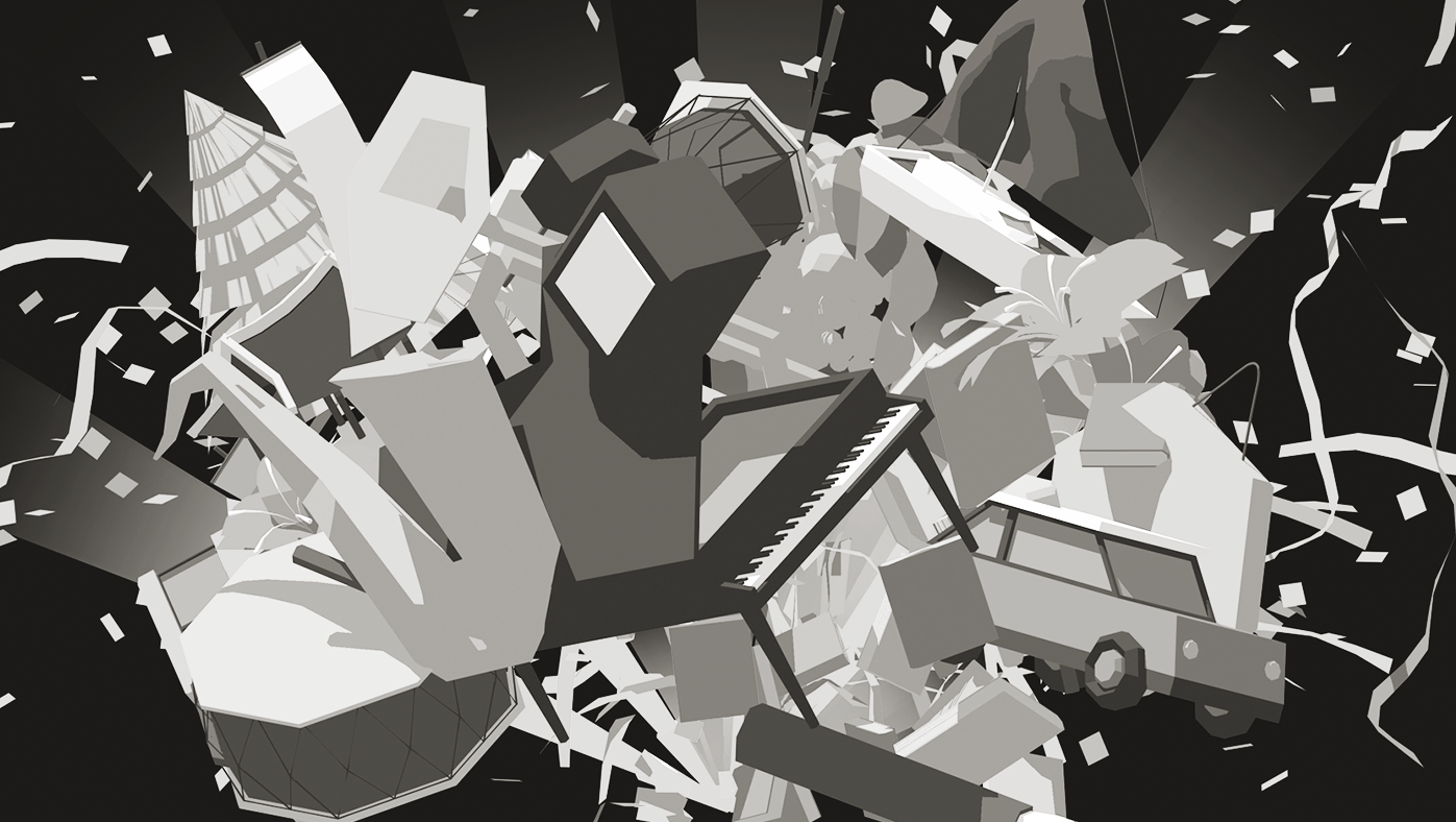
─────────────────────────────────────────── Headrock VR
This is a logo design and motion graphic project for Headrock VR. Unlike other ordinary VR game arcades, it has a conceptual theme of VR party with music. I caught keywords vivid and party.
November, 2018
Branding, Motion Graphics, Graphic Design
━
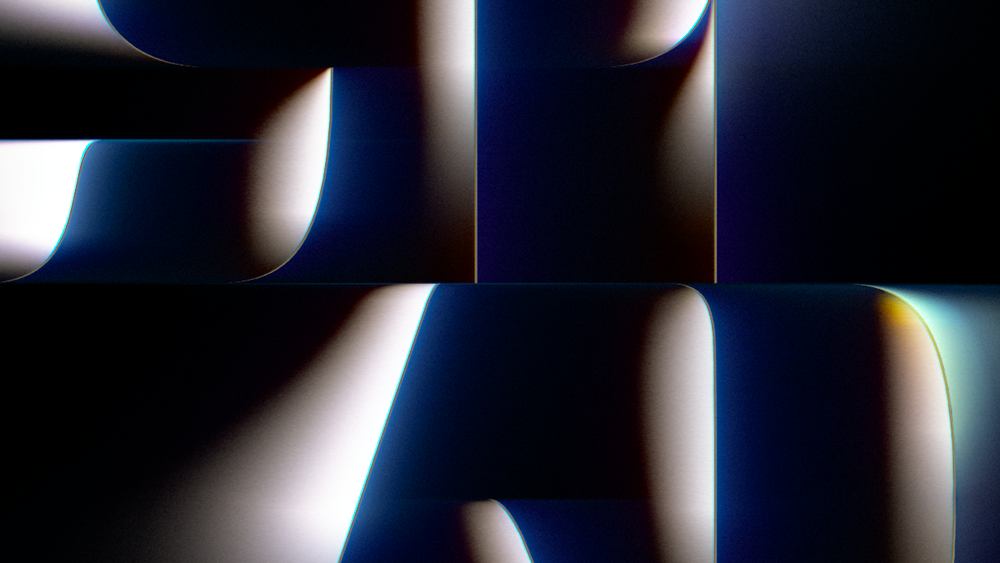
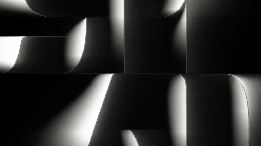
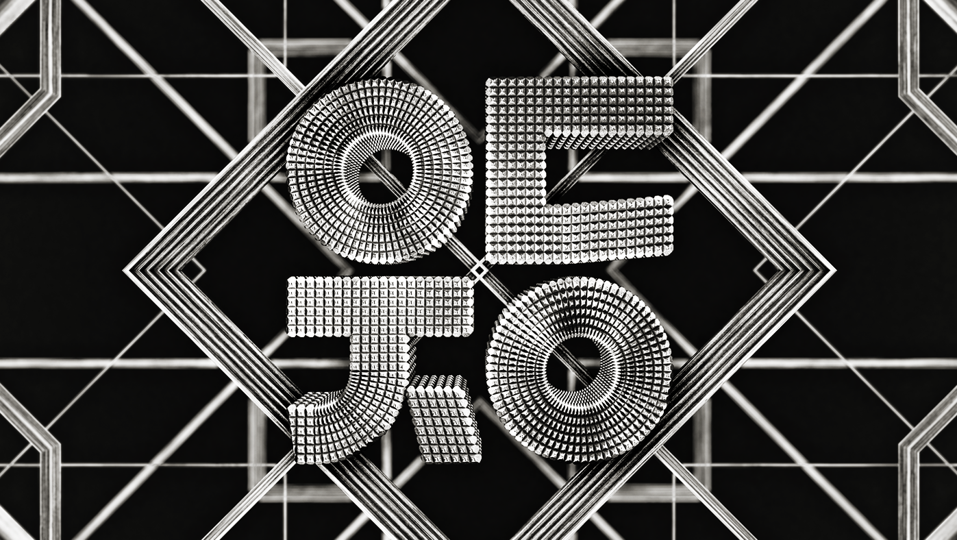
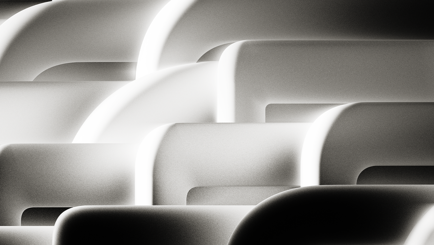
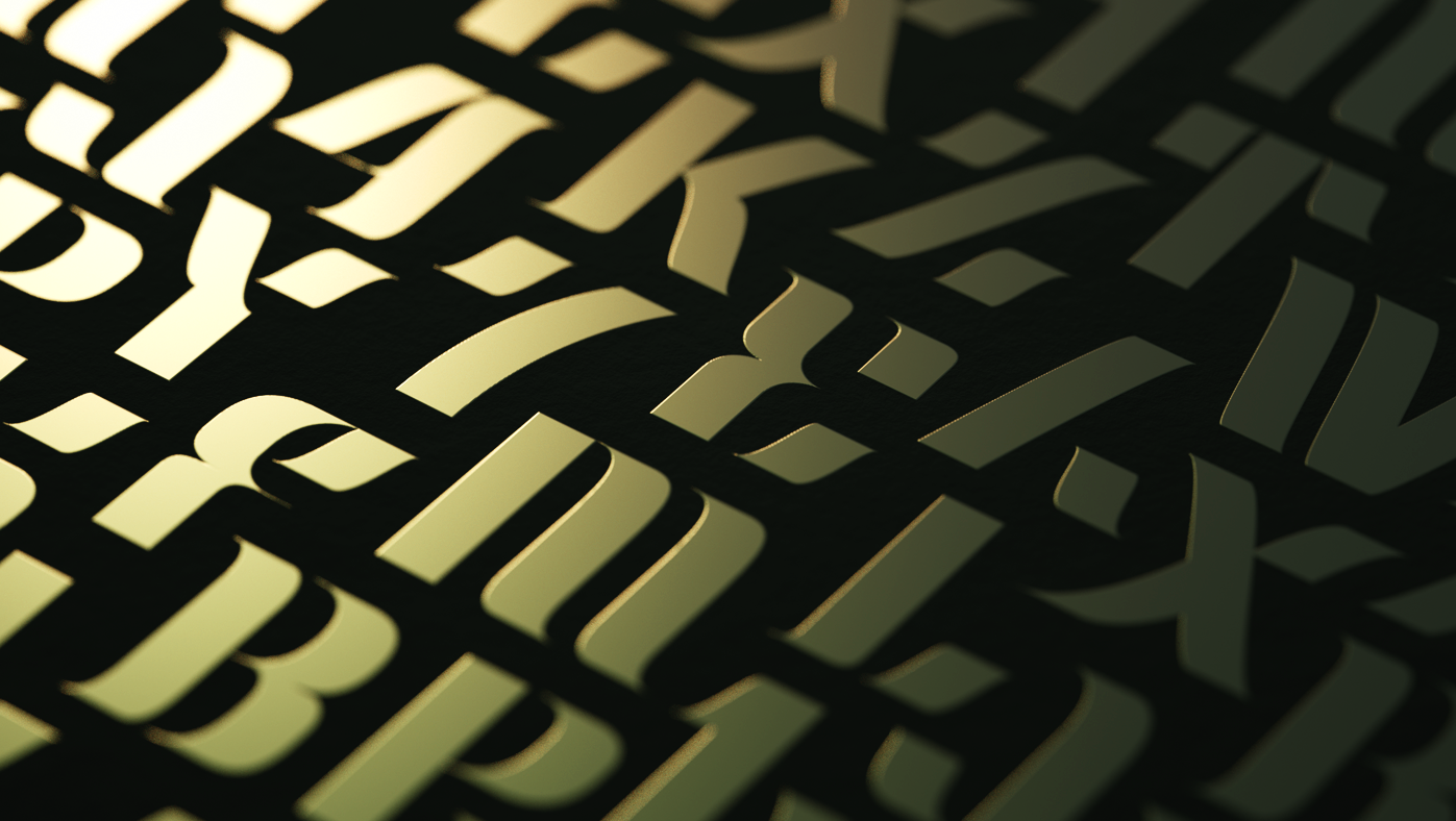
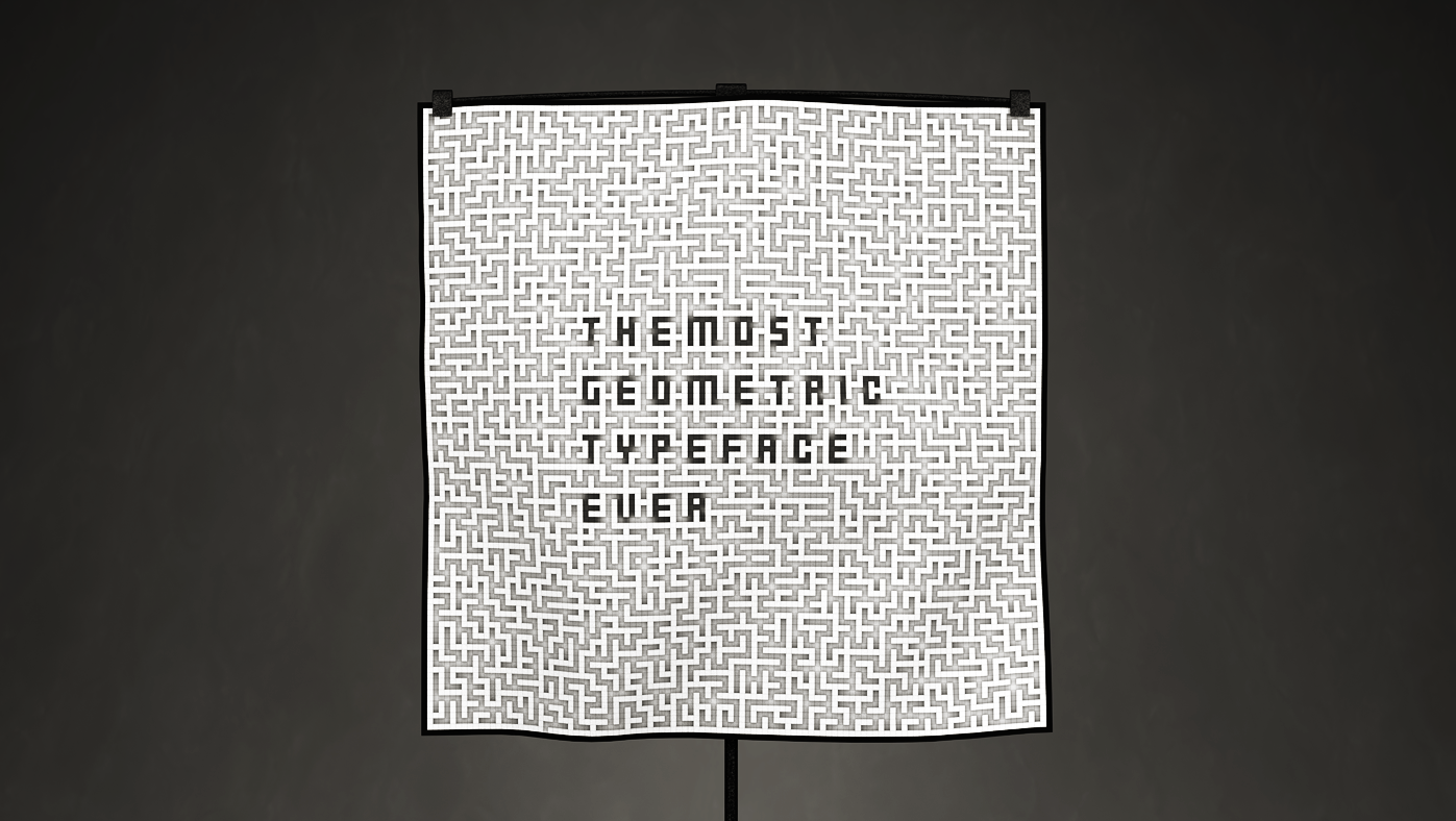
─────────────────────────────────────── CK Font02_SHADE
This is a set of typographic artworks using CK font. This font is based on the shape of my logo"CK". This is still on-going project and same series of artworks will be published in the future.
August, 2021
Graphic Design, 3D Art, Typography
━
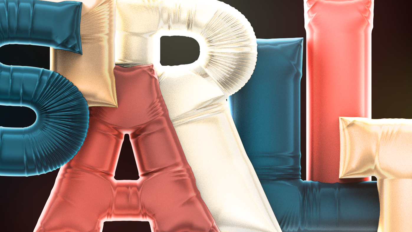
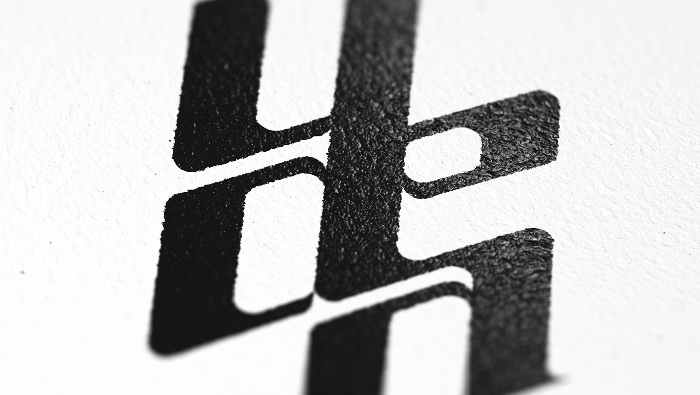
───────────────────────────────────────────────── Logos
These are logo projects I have done for first 6 month in 2019. No font used, every letter has been designed by my self. These logos are not official but picked by myself among candidates.
August, 2019
Branding, Graphic Design, Typography
━
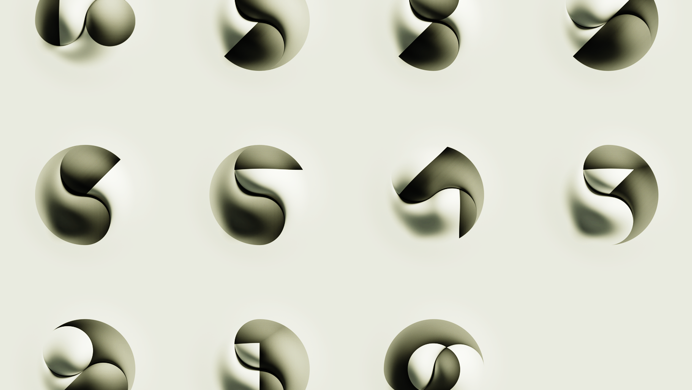
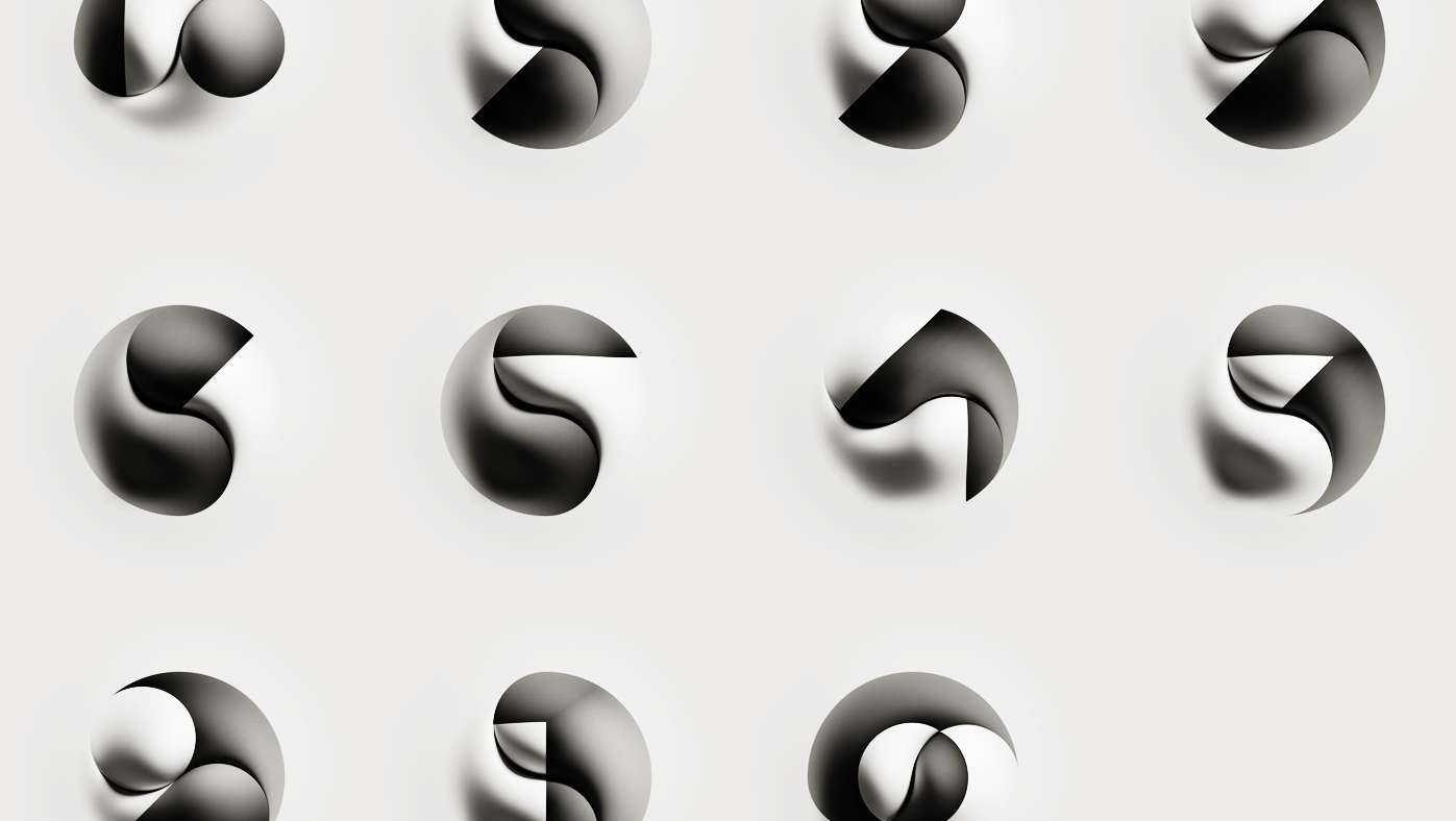
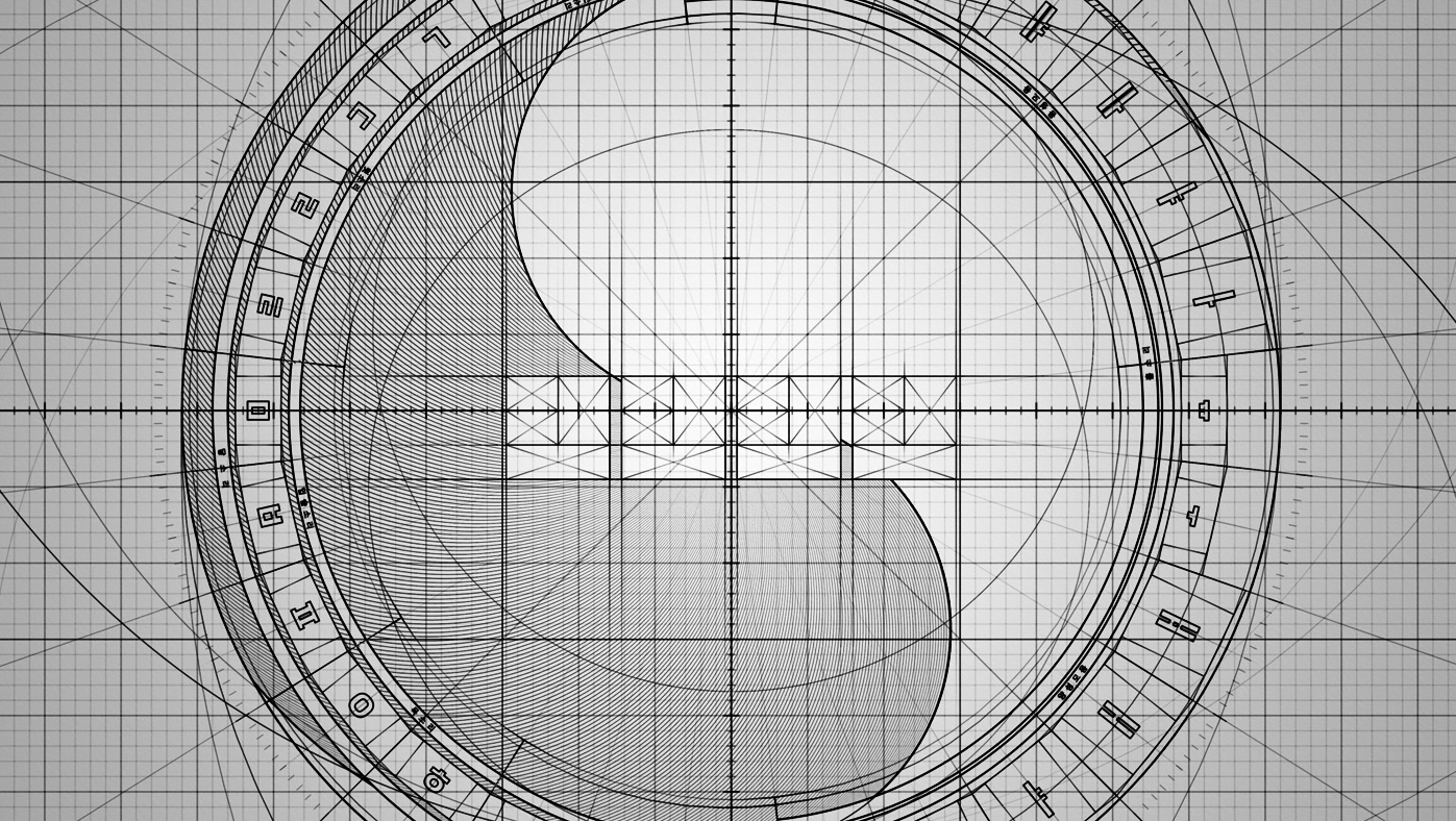
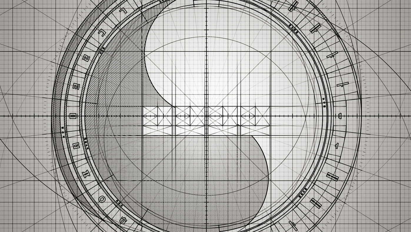
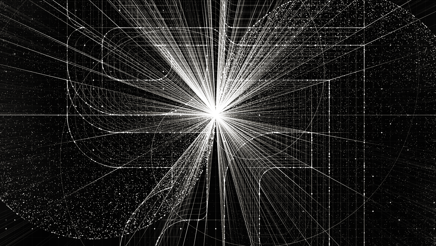
──────────────────────────────────── Yin-Yang Countdown
This project is a projection mapping concept design in Pyeongchang Olympic's opening ceremony. A challenge is typographic inclusion of Taegeukgi. I shaped numbers on a grid of Yin-yang symbol.
October, 2018
Motion Graphics, Graphic Design, Typography
━
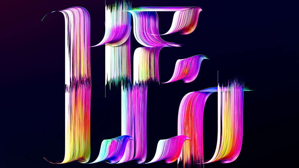
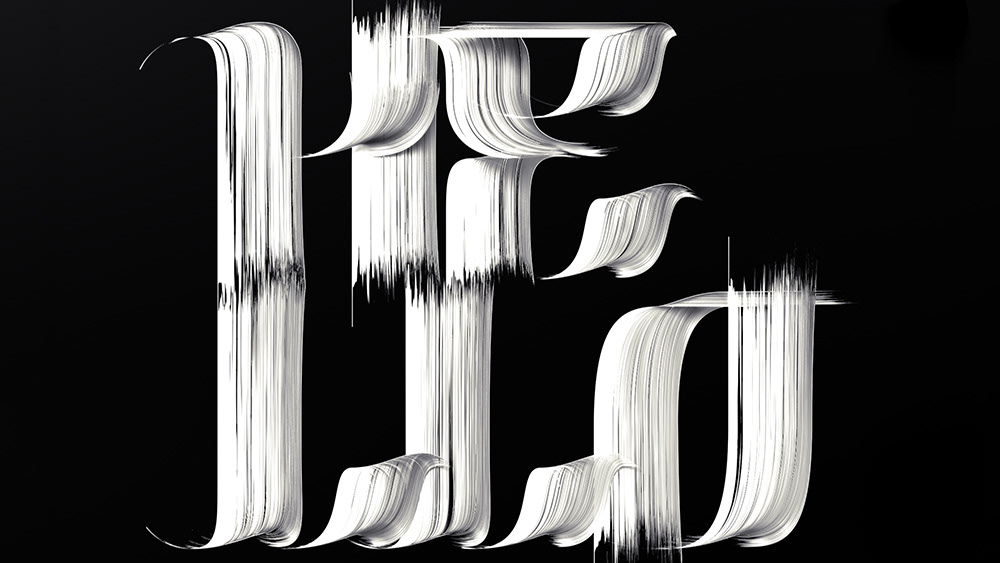
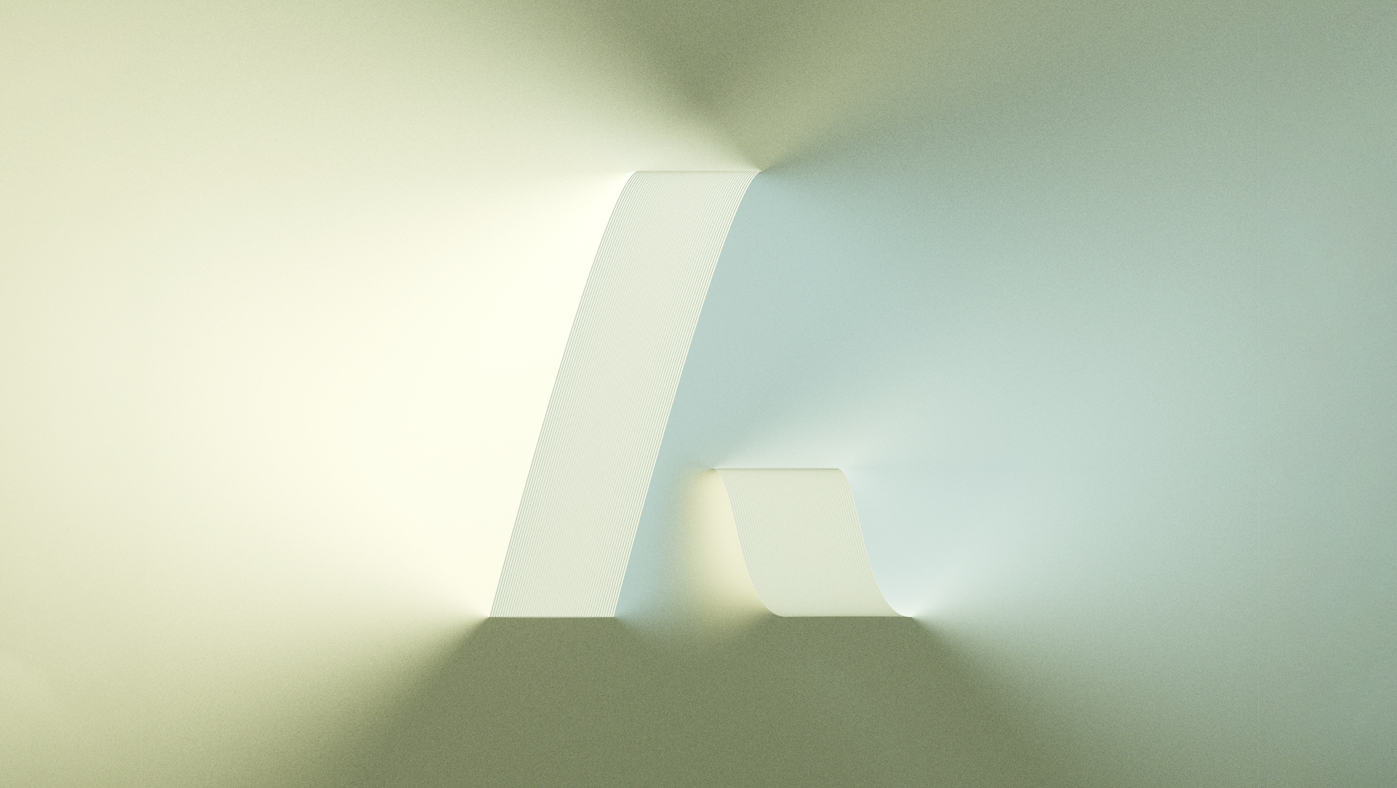
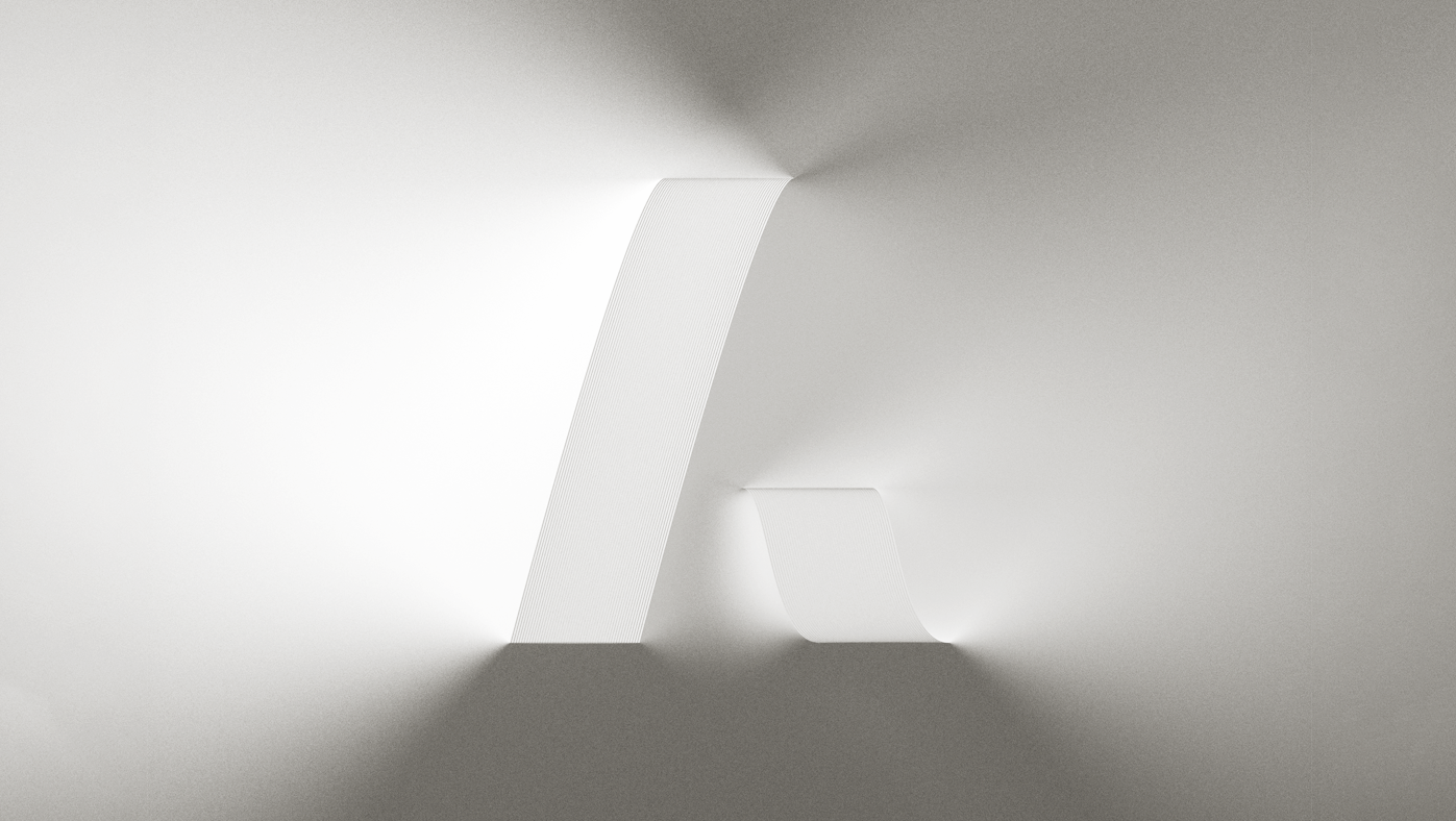
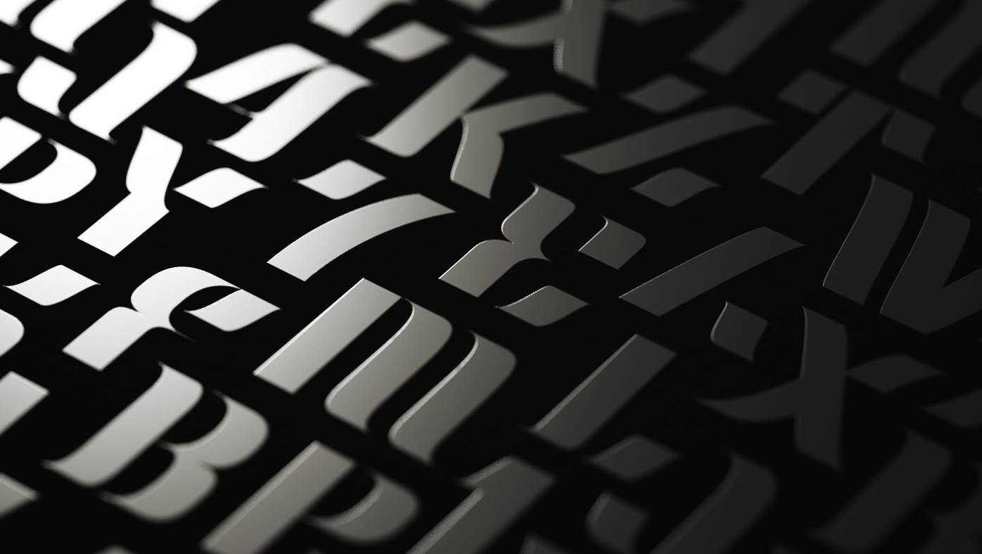
─────────────────────────────────────── CK Font02_Brush
This is one of typography project series using CK Font02. I made brushing texture following lines of the font. The original font and its project will be published soon.
August, 2021
Graphic Design, Typography, 3D Art
━
───────────────────────────────────────────────── Logos
These are logo projects I have done so far. Typographic play is core concept of most of the projects. Some of them are not published but the others are.
July, 2016
Branding, Graphic Design, Typography
━
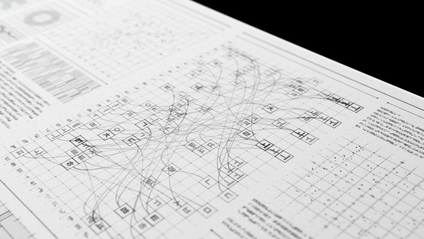
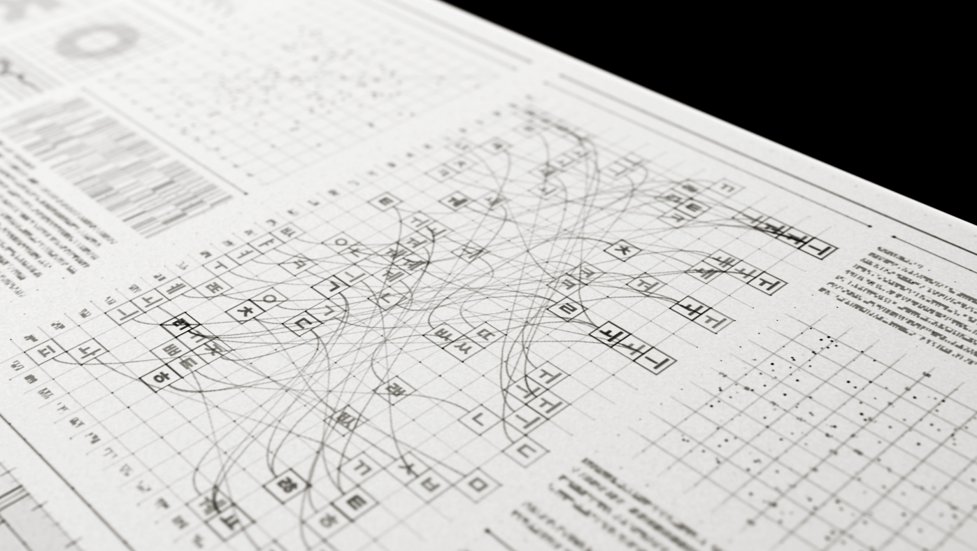
───────────────────────────────────── Parade of Nations
This project is a Hangul names of nations concept design for projection mapping of parade of nations in Pyeongchang Winter Olympic's opening ceremony.
October, 2018
Motion Graphics, Typography, Graphic Design
━
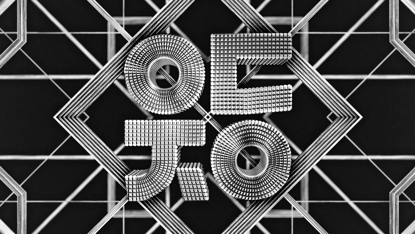
──────────────────────────────────────────────── Hangul
In South Korea, we have an anniversary for our letter system "Hangul." I have decided to make a motion poster dedicated to the letter of Korea.
December, 2015
Editorial Design, Graphic Design, Motion Graphics
━
──────────────────────────────────────────── Yoondesign
This project is a conceptual brand movie for Yoondesign. I tried to represent their desire to be a total design agency on various graphics which start from a lettering sketch.
July, 2016
Branding, Motion Graphics, Typography
━
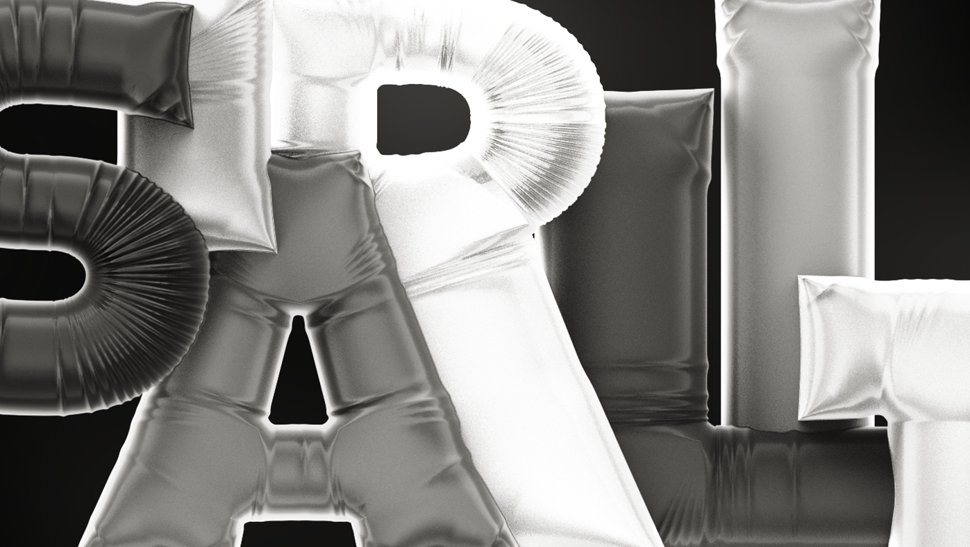
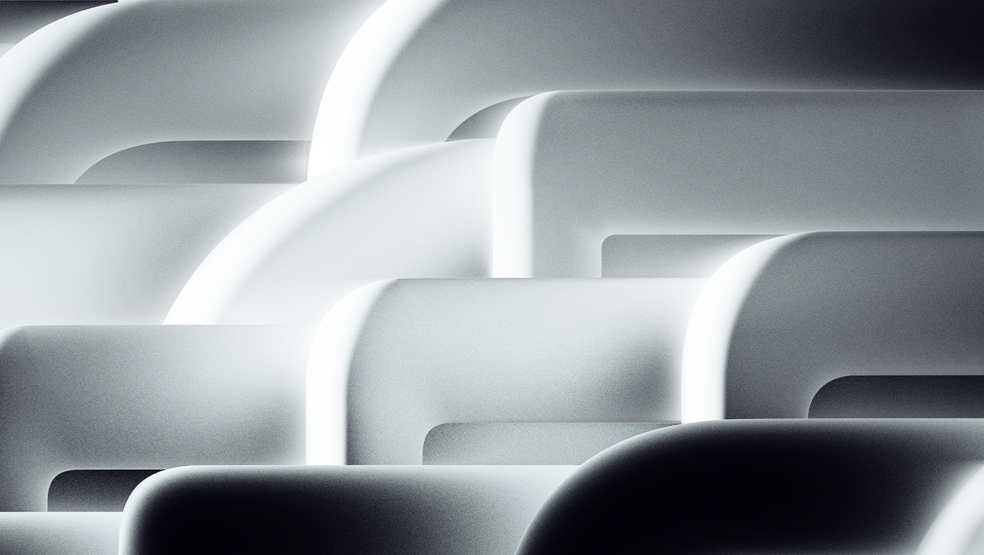
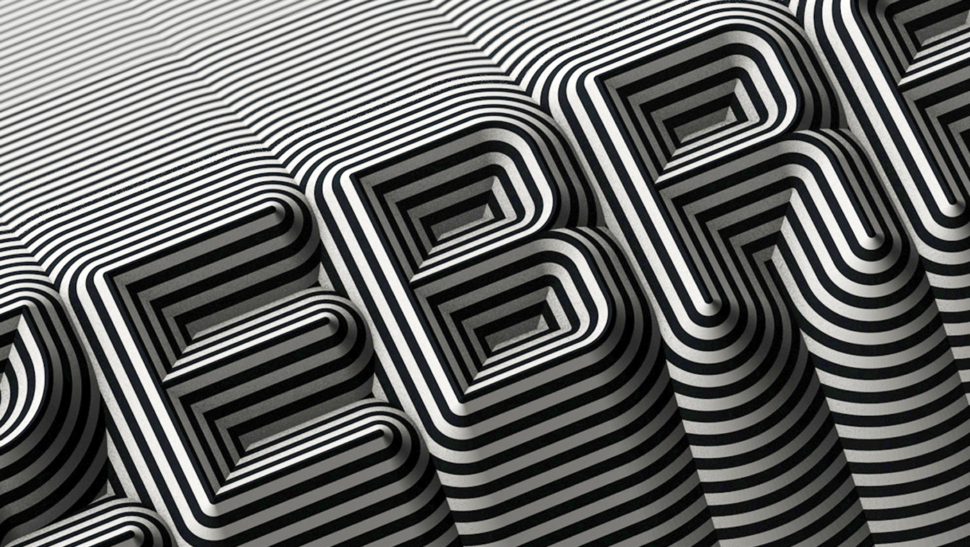
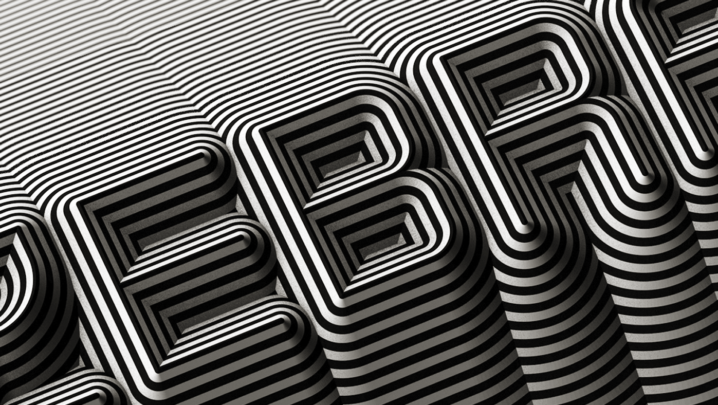
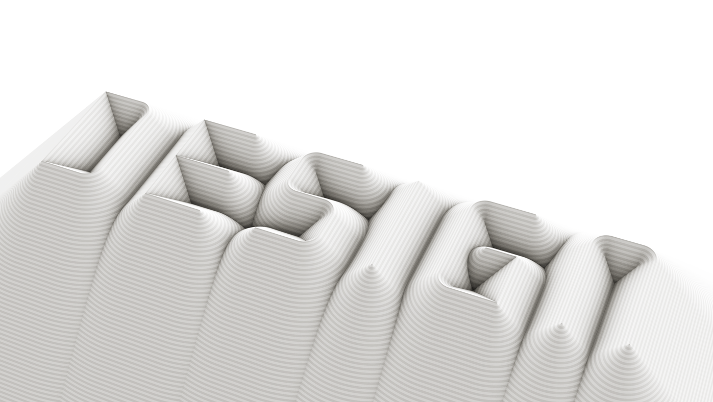
──────────────────────────────────────────── CK Font_02
This is a simple typography project of CK Font. I added slick and soft blur out side of letter. The typeface has constant thickness and height which make this regular vertical stripe pattern.
April, 2017
Graphic Design, Typography, Branding
━
────────────────────────────────────── YoonGulim Poster
This is a poster design project for a Korean font 'YoonGulim', a rounded version of YoonGothic 700. This project includes 3 pieces of posters and a font logo.
August, 2019
Branding, Graphic Design, Print Design
━
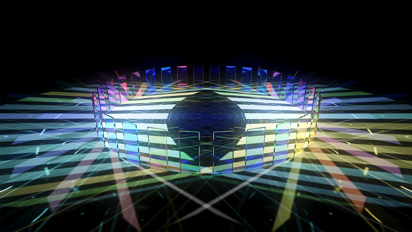
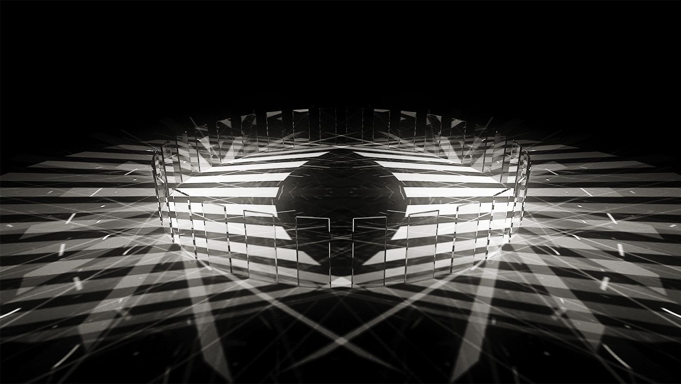
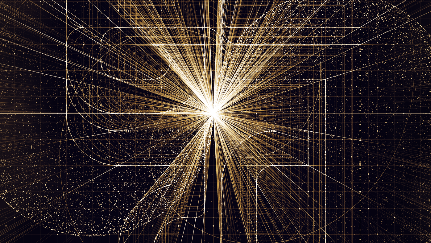
──────────────────────────────────────── Glass Caustics
This project is a concept design for projection mapping in the hotel Paradise City. The key concept of this graphic is color variation of shadow through plates of glass.
October, 2018
Motion Graphics, Graphic Design, Digital Art
━
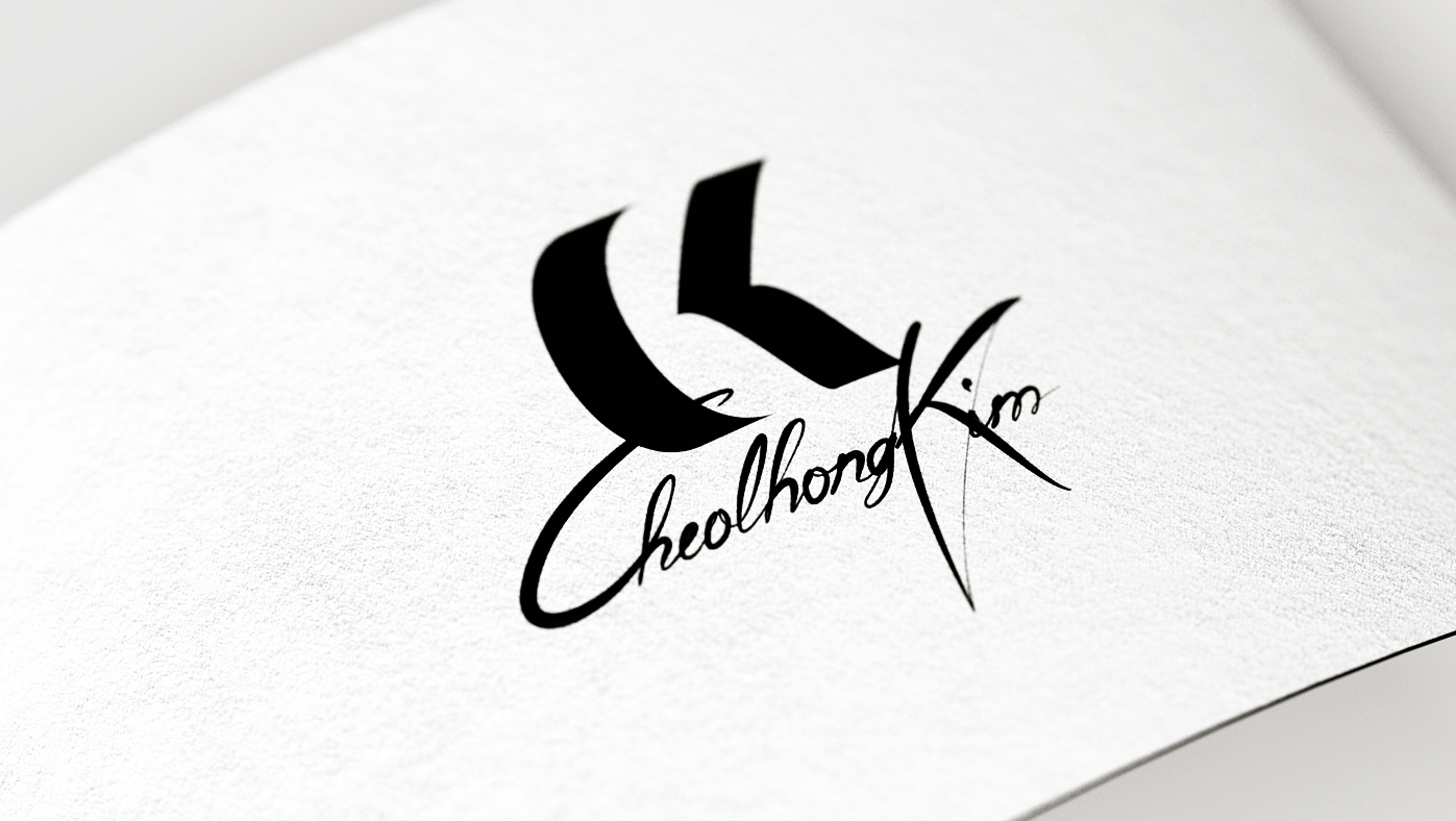
──────────────────────────────────────────────────── CK
My name is Cheolhong Kim and I just finished this personal identity project using the initial of my name. CK is a monogram logo which has combination of letter C and K.
March, 2017
Branding, Typography, Graphic Design
━
─────────────────────────────────────────────── CK FONT
Project CK Font has been finished and I really glad to share it. The shape of typeface has been designed based on grid system of CK logo. Which makes them have the same thickness and height.
March, 2017
Graphic Design, Motion Graphics, Typography
━
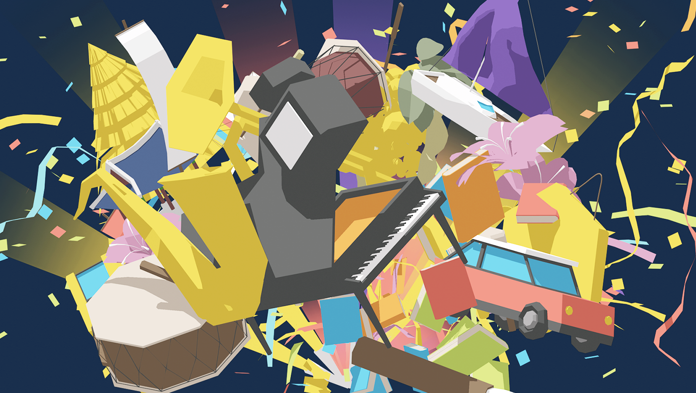
────────────────────────────────────────── GTO PR Video
This is a motion graphic work done for GTO. For friendly look and feel, I modeled over-sized shapes and picked pastel-like-colors. Story board, sound and narration has been given.
October, 2018
Motion Graphics, Graphic Design
━
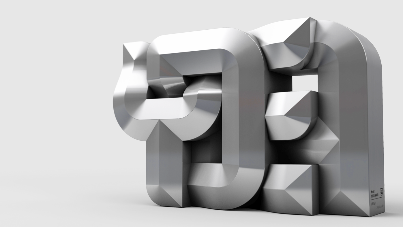
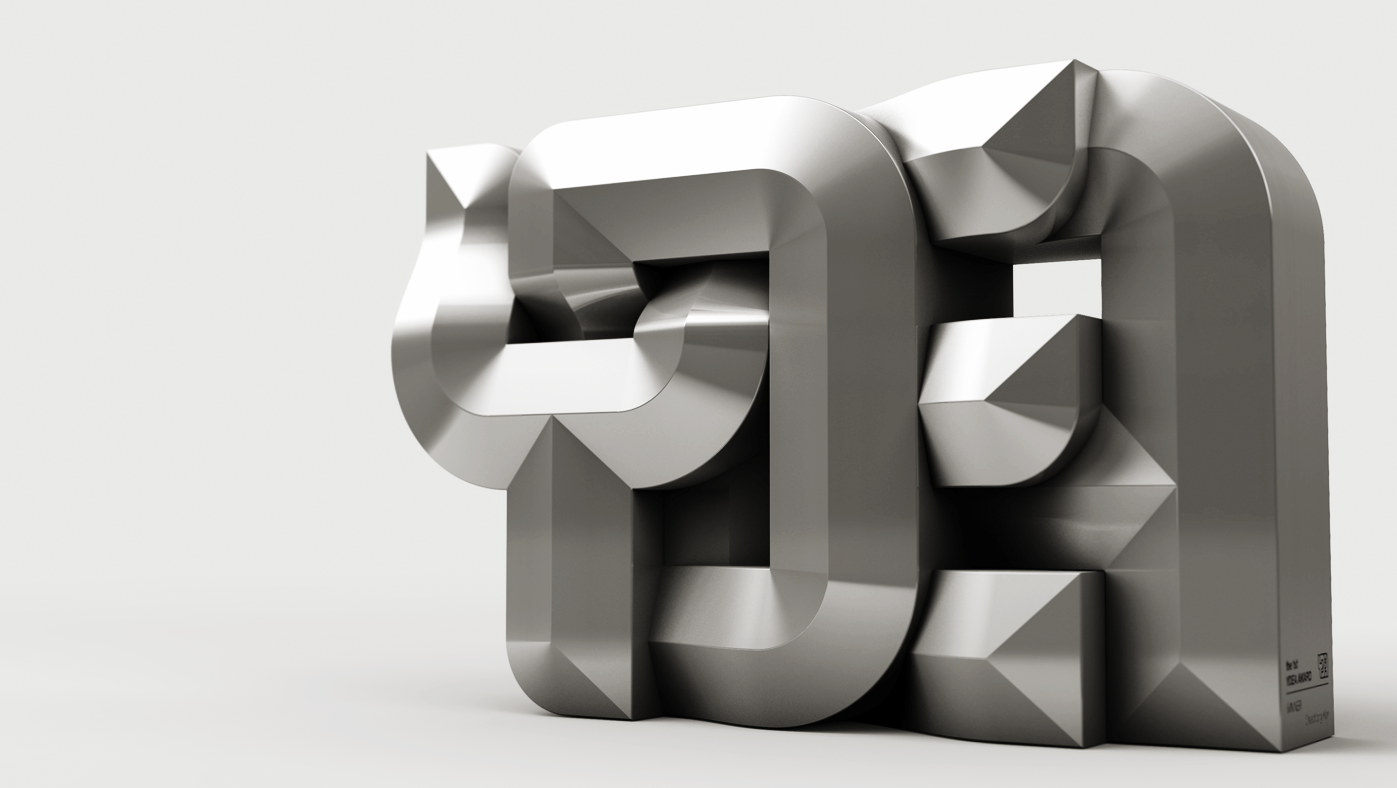
────────────────────────────────────────────────── YDEA
Group Y planned to hold an creative award which named as YDEA AWARD. Its naming came from a combination of letters Y and Idea. I have made the logo and trophy with typographic letter mixing.
July, 2016
Branding, Product Design, Typography
━
────────────────────────────────────────────── Kwangbok
It was 70th anniverssary since Korea has get liberated from Japan which named as "Kwangbok" meaning regaining light. I decided to make a poster for the day with the meaning of the day.
June, 2016
Editorial Design, Graphic Design, Typography
━
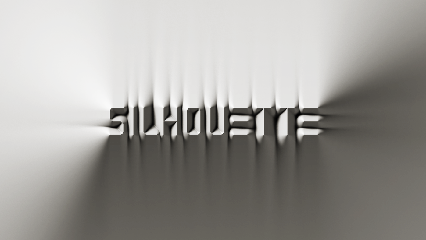
───────────────────────────────────────── Silhouette_02
These images are made of Graphic Fonts 'Silhouette' which is a subproject of Grid. All letters and numbers are generated as 3d model. Therefore any words and messages are easy to be made.
June, 2015
Digital Art, Graphic Design, Typography
━
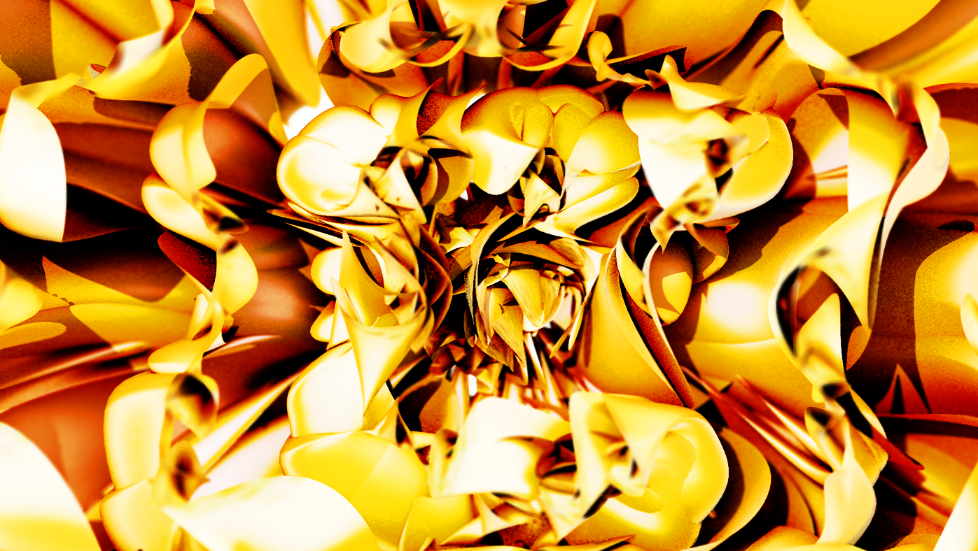
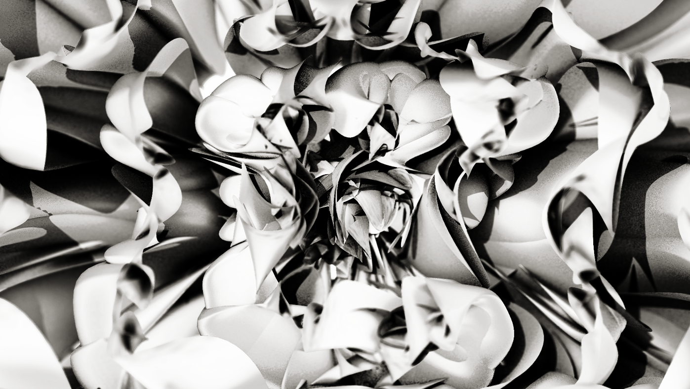
────────────────────────────────────────────── Flobaris
Flobaris is a flower brand. I was offered a series of brand movie clips for them. I have proceed the project with an instinctive concept which is the motion of blooming flower.
February, 2016
Digital Art, Graphic Design, Motion Graphics
━
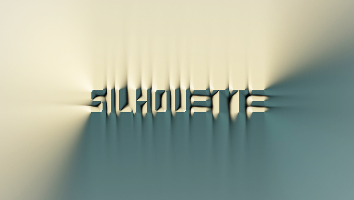
──────────────────────────────────────────── Silhouette
This project is a set of graphic font referring the grid typeface. All letters and numbers are generated as 3d model. Therefore any words and messages are easy to be made.
January, 2015
Digital Art, Typography
━
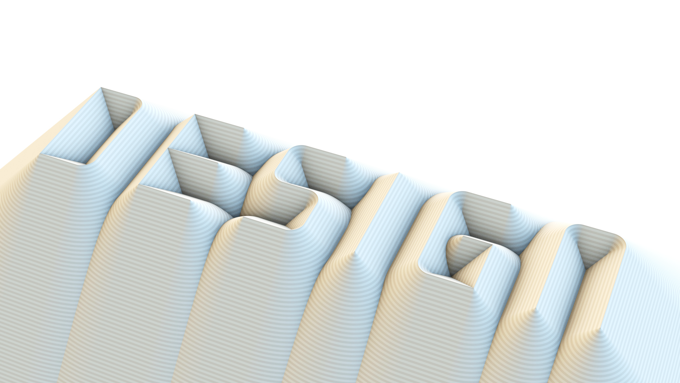
───────────────────────────────────────── Silhouette_03
These images are made of Graphic Fonts 'Silhouette' which is a subproject of Grid. All letters and numbers are generated as 3d model. Therefore any words and messages are easy to be made.
June, 2015
Digital Art, Graphic Design, Typography
━
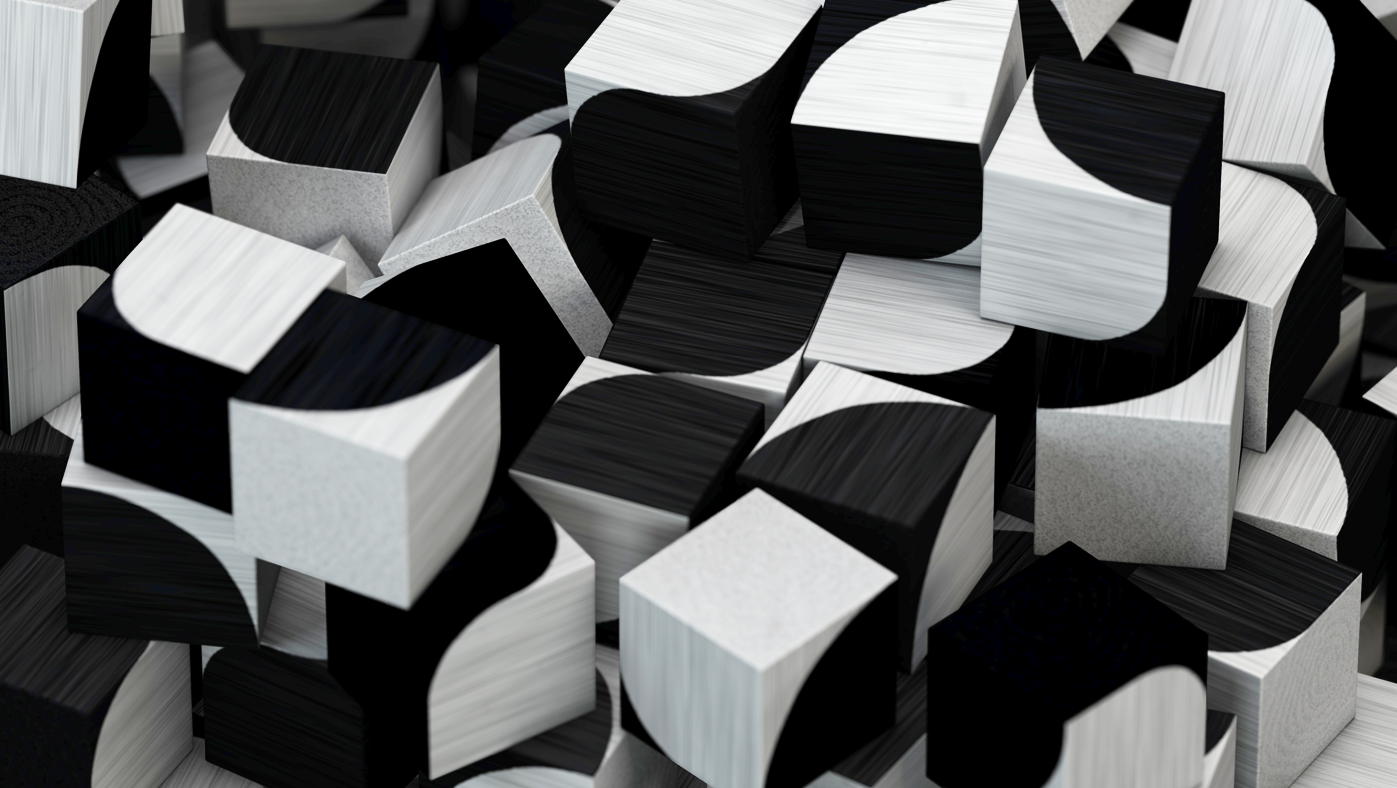
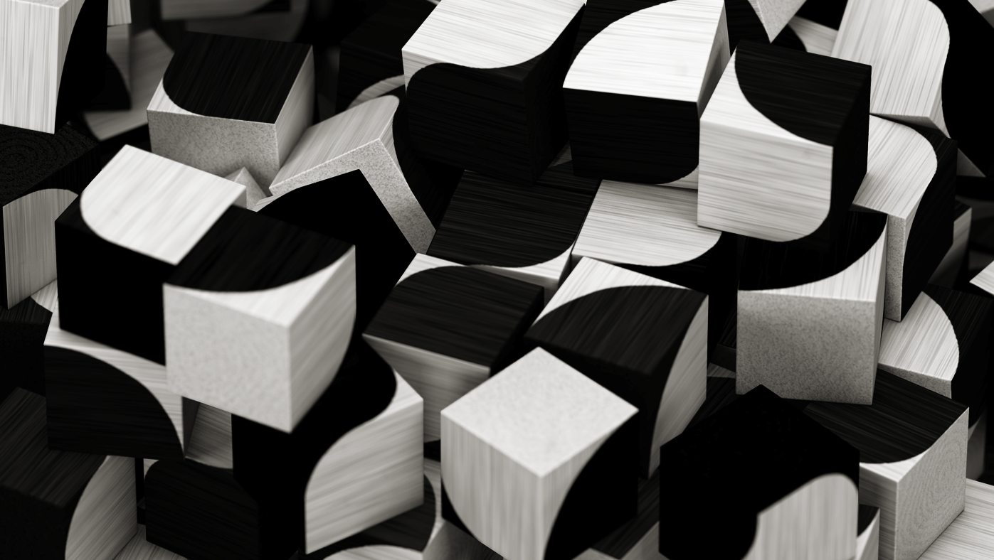
──────────────────────────────────────────── GRID BRICK
This is subproject of grid typeface which has been designed to be modularized easily. Therefore the type system makes possible to build all letters and numbers with only 6 patterns of the cube.
July, 2014
Packaging, Toy Design, Typography
━
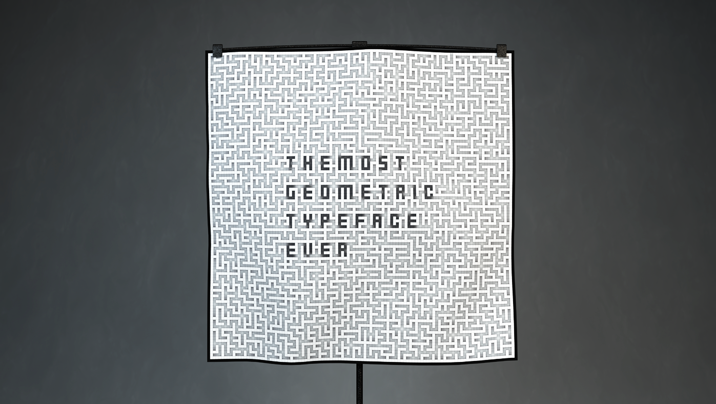
────────────────────────────────────────────────── GRID
GRID is a personal project for my graduate exhibition 2013. All the letters has been built based on 3X5 square grid cells. It contains 2 types of base font and 100 family fonts on grid-based panel layout.
August, 2014
Exhibition Design, Typography
━